Adding the `filter: grayscale(1)` CSS rule is an easy way to notice places your design is too dependent on colour
This is the blog post version of a talk I gave at the Perth Web Accessibility Conference. I also repeated the talk at a “BrownBag” team lunch at Culture Amp, which you can watch here, or you can read the blog-post version below. I’ve got a live example (open source! try it yourself!) at the end of the post.
On the front-end team at Culture Amp, we’ve been working on documenting and demonstrating the way we think about design, with a design system – a style-guide and matching component library for our designers and developers to use to make our app more consistently good looking, and more consistently accessible.
But first, a story.
Here’s a photo of me, my older sister, and younger brother:
Me at the back, my sister and brother in the front
Me and my brother are both red-green color blind. Most of the time color-blindness isn’t a big deal and compared to other physical limitations, it doesn’t usually make life difficult in any significant way.
But growing up, my brother Aaron really wanted to be a pilot. Preferably an air-force pilot, like in Top Gun. But for a generation that grew up with every TV show telling us “you can be anything if you try hard enough”, there was a footnote: anything except a pilot. He couldn’t be a pilot, because he was red / green color blind. The air-force won’t even consider recruiting you for that track. They’ll write you off before your old enough to join the air cadets.
Why? Because the engineers who designed the cockpits half a century ago made it so that the only way you could tell if something changed from safe to dangerous was if an LED changed from green to red. So people with red-green color-blindness were out, and my brother was told he couldn’t be a pilot.
Cockpits have lots of small controls, and some of them rely purely on red/green color distinction to be read accurately.
Now, becoming an air-force pilot is super-competitive, and he might not have made it anyway, but to have your dream crushed at the age of 10, because an engineer built a thing without thinking about the 8% of males who are red/green color blind, is pretty heartbreaking.
Luckily, as web professionals we’ve got a chance to create a digital world that is accessible to more people, and is a more pleasant experience, than much of the real world. We just have to make sure it’s something designers and developers are thinking about, and something they care about.
So, design systems
One of the big lessons we’ve learned in the web industry over the last few years is that if you want your site, product or service to leave a lasting impression, it’s not enough to do something new and shiny and different. What’s important to a lasting impression is consistency: consistency builds trust, and inconsistency leads your users into confusion and frustration and disappointment.
It’s true of your branding, it’s true of your language and tone, it’s true of your information architecture, and it’s especially true of your commitment to creating accessible products and services. For example if your landing page is screen-reader friendly but your product is not, you’re going to leave screen-reader users disappointed. Consistency matters.
But as a company grow, consistency gets harder. It’s easy to have a consistent design when you have a landing page and a contact form. It’s harder when you have a team of 100 people contributing to a complex product.
The Culture Amp team has experienced those growing pains – we’ve grown from 20 employees three years ago to over 200 today, almost half of them contributing to the product – and it’s easy to lose consistency as users navigate from page to page and product to product. The UI built by one team might feel different and act differently to the UI built by another team.
So we started looking into design systems.
The Salesforce “Lightning Design System” showed how a strong design system can bring consistency to a whole platform, even with 3rd party developers
Design systems are a great way to bring consistency. By documenting the way we make design decisions, and demonstrating how they work in practice, we can help our whole team come together and make a product that looks and feels consistent – and that consistency is the key to a great experience for our users.
As we codify our design thinking we are lifting the consistency of our app – not just of our branding and visual aesthetics, but of our approach to building an accessible product.
Culture Amp’s approach to color
So we’re a start-up, with three overlapping product offerings build across half a dozen teams. And we want to make that consistent.
One way to do that would be to have a design dictator who approves all decisions about color usage, making sure they’re on-brand and meet the WCAG contrast guidelines. But one of our company values is to “Trust people to make decisions”, and that means trusting the designers and front-end engineers in each team to make the right call when it comes to picking colors for the screens they are in.
How do we let them make the call, but still ensure consistency?
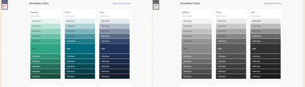
Well, as a group our designers worked together to define the palette they would agree to use. They consisted of three primary colors (Coral, Paper and Ink), six secondary colors (Seedling, Ocean, Lapis, Wisteria, Peach, Yuzu), as well as Stone for our standard background.
Our color system starts with 3 primary colors and 6 secondary colors. I have no idea how the team picked the color names…
Every color on the page should be one of the colors on the palette.
But what about when you need it slightly lighter or slightly darker? When you need more contrast, or want just a slight variation? We allow designers to use a color that is derived from the original palette, but with a tint (white mixed in) or a shade (black mixed in).
We can actually figure these tints and shades out programmatically, using SASS or Javascript:
(The embed here demonstrating programmatically generating colour palettes no longer works, sorry)
(Note: the SASS code is even easier. You can use the lighten() or darken() functions, or the custom mix() function if you’d prefer to tint or shade with a custom color. All three of these functions are built in.
So now we have three primary colours, and six secondary colours, and computationally generated tints and shades for each in 10% increments, resulting in 171 colour variations, which all fit with our brand. Woo!
By adding tints and shades to our base colors, we can generate a flexible but consistent color palette
This range gives enough freedom and variety to meet individual teams needs on a page-by-page basis, while still bringing consistency. Designers are free to move within this system and make the right decision for their team.
So what about color contrast?
Currently Culture Amp has committed to complying with WCAG AA standard contrast ratios. This means the contrast between the text color and the background color must be at least 4.5 for small text, and at least 3.0 for large text. (If we wanted to go for WCAG AAA standard contrast ratios, those values 7.0 and 4.5 respectively).
How do we get the designers and developers on our team thinking about this from the very beginning of their designs? We could audit after the designs after-the-fact, but this would be frustrating for designers who have to revisit their design and re-do their work. Making people re-do their work is not a way to win friends and advocates for your color contrast cause.
<Note: I had an embed here, that demonstrated auto-generated colour palettes, but it no longer works>
So we can actually check whether our colors will be able to hold white or black text with a sufficient contrast ratio. And because we derive our color values programmatically, we can check if all 171 of our derived color values are accessible with large text or small text, black text or white text, and display all of that information at a glance:
We can programmatically check contrast, and show at a glance which colors support white text or black text at small and large sizes.
Now our designers can come to this page, explore every color within our palette, and at a glance know which of these colors will be able to display text with sufficient contrast to be considered accessible.
For bonus points, we can also programmatically determine if a background color would be better suited to have text colored white or black:
<Note: I had an embed here, that demonstrated auto-generated colour palettes, but it no longer works>
If you build it, they probably won’t come
So we’ve made a great page where designers can explore our palette colors, and at a glance gain an understanding of which combinations will have sufficient contrast. But by this point everyone in the software industry should hopefully know that “if you build it, they will come” is simply not true. If you want people to engage with your design system – or with anything you’ve built – you need to offer something of value, you need to solve a real problem for them.
So how do we get the designers and developers across our different teams to care enough to come look at this page? We need to offer them some convenience or solve a problem they have.
What are the most common things our team needs help with when thinking about our brand colors? They usually want to explore the range of the palette, and then find a HEX code or a SASS variable to start use that color.
People on the team need to know what the brand colors are. Now we can send them to this page, and they’ll see the accessibility info as a bonus.
We have a dropdown that lets our team copy/paste the colour values so they can use them in their design tools or their code
So we tried to make our design system colors page as helpful as possible, providing a way to explore the colors, see the shades and tints, see what colored text it best pairs with, and copy color values to your clipboard.
Next time someone needs to reference our brand colors, this feature set means they’ll come to our design system page first, because they know they can explore the colors, and get the correct codes in whatever format they need. We’re solving a problem for them, and, while we have their attention, using the opportunity to inform get them thinking about color contrast and accessibility.
What else?
So we’re just getting started on our journey of using design systems to improve the consistency of our design and our accessibility. But color contrast is a great place to start, and it’s already making me think about how we can use the design system project to put accessibility front-and-center in the design culture of our team.
The web’s most popular component library, Bootstrap, solves a problem for designers and developers by allowing fast prototyping of common website elements, but by offering components with accessibility concerns baked in, and by encouraging good accessibility practice in their documentation, they’ve used their design system to lift the level of accessibility on millions of websites.
Bootstrap was one of the first open source component libraries, and works hard in its documentation to encourage accessible use of its components.
If you have other ideas on how design systems could be used to bake accessibility into your team culture and product design, I’d love to hear about it! It’s an exciting project to be part of, raising the design consistency and the accessibility consistency across the various products offered at Culture Amp.
If you’d like to join us, Culture Amp is hiring front end developers – either in Melbourne, or remote within Australia. It’s an amazing place to work, I’d encourage you to apply. See the Culture Amp Careers page for more info.
Bonus #1:
Our whole Color Showcase component is now available open source. You can view the Color System Showcase repo on Github or even try embed it online by entering JSON code on this page. (Sorry, this link no longer works).
Here’s a live iframe preview with Culture Amp colors inserted:
Bonus #2:
If you want to test how your site would look to a completely color-blind person, you can type this into the browser console:
document.body.style.filter="grayscale(1)";
Try it!
Adding the `filter: grayscale(1)` CSS rule is an easy way to notice places your design is too dependent on colour


One reply on “How a design system can encourage accessible, on-brand colors”
[…] (Read more about that in my post How a design system can encourage accessible, on-brand colors.) […]