Design Systems and Team Culture
This week at the UX Perth meetup I shared this talk about the human side of building design systems – how your team culture affects the design system you are building, and how the design system can affect the team culture you are building.
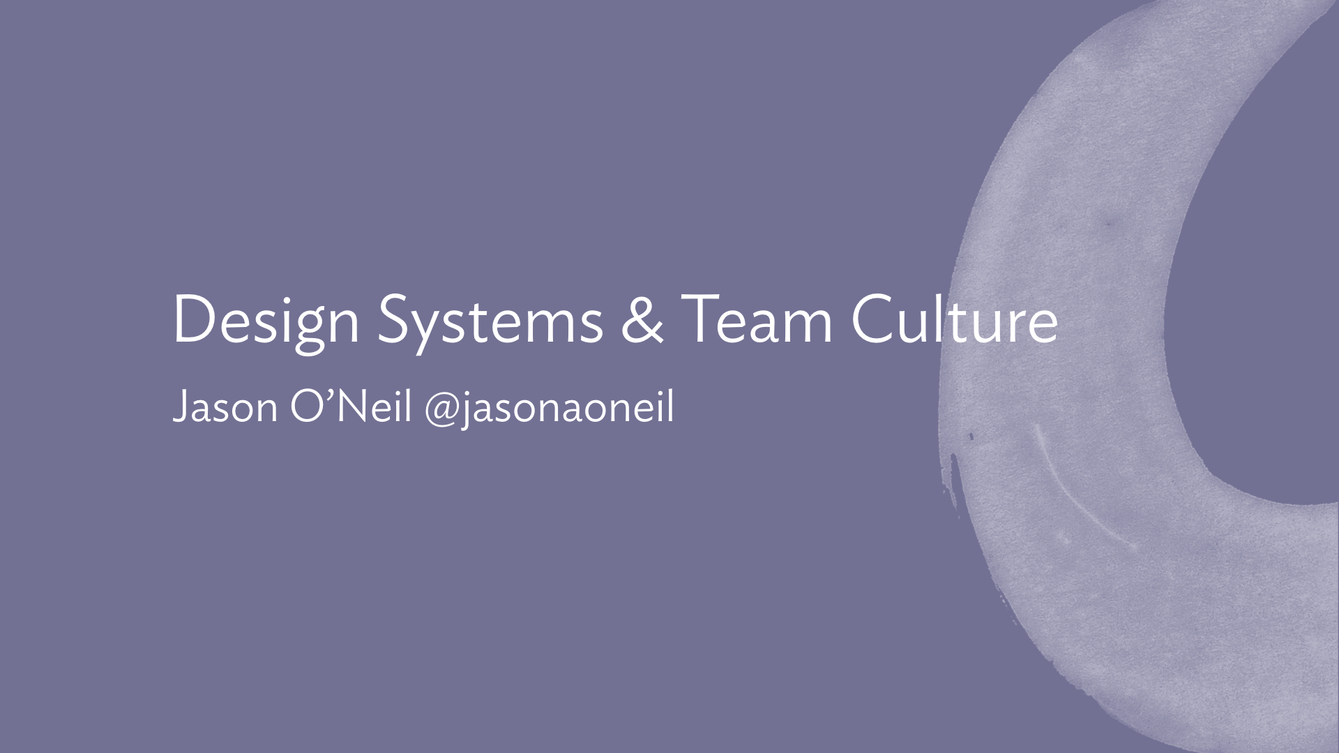
At Culture Amp, we operate on a “team of teams” model. We currently have about 200 staff, with about half of those contributing to the product as engineers, designers, product managers, QAs etc. Each product feature has a team responsible for it, and this team is “cross-functional” – so rather than a single infrastructure team, each team should have its own infrastructure specialist. Rather than there being a single design team, each team should have a designer.
The idea is that each team should be able to move to its own priorities without being blocked by other teams. But as you can imagine, this can lead to people being out of sync.
Designers on different teams might be making simultaneous decisions about the styling of a button, and reach two different conclusions, resulting in two button styles.
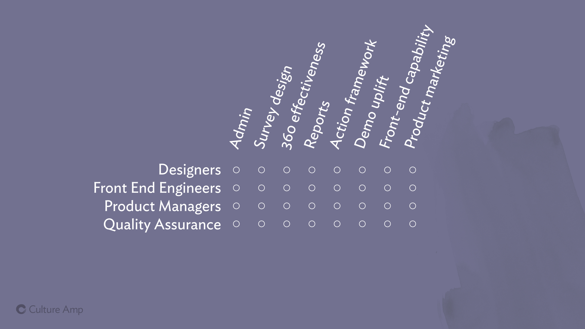
In other disciplines, like Front End Engineering, you have people from across different teams working on different products with different code-styles (and even different languages!) How do we make sure that people on different teams can produce work that is consistent, high quality, fast to build and easy to maintain?
And then within a team, how can we make sure designers, engineers, product managers and everyone else is speaking the same language, and making decisions from the same framework?
Can we avoid designers saying things like “Use Ideal Sans, size 12px, line height 18px, all caps, and maybe some tighter letter-spacing?” and instead say “Use the Label style”.
Establishing sensible defaults, and giving names to them, enables your team members to talk to each other with less confusion and ambiguity – and that clear communication helps lead to less mistakes and faster work. It also helps product managers know which styles already exist and can be used, and which ones the team needs to invest in creating from scratch.
Across the business, we want to align everyone, so that our product looks and feels consistent, no matter which team built it. And we want to speed up people in all roles on all teams, so that they can spend less effort recreating yet-another-button-component, and focus more on delivering real features that benefit our customers.
This is where design systems really shine: they give a common language that designers, PMs and engineers can use to all be on the same page. They help bring consistency in fonts, colors, styles and components to people on different teams who don’t interact often. And they give us a platform to build common, re-usable designs that can be shared across teams, enabling all the teams to build things faster and with more consistency.
How our company values interplay with our style guide efforts
So building a design system was the right call for us at Culture Amp. But how does that play out with the actual people, each with a specific role on a specific team? How does it affect our approach to work, and more importantly, to team work? How does the design system interplay with our team culture?
At Culture Amp we spend a lot of time talking about our company values, because our aim is to be “Culture First“, to focus on having an amazing work culture, working and living according to a shared set of values, and to let achievement and success arise from that culture.
So we have four values:
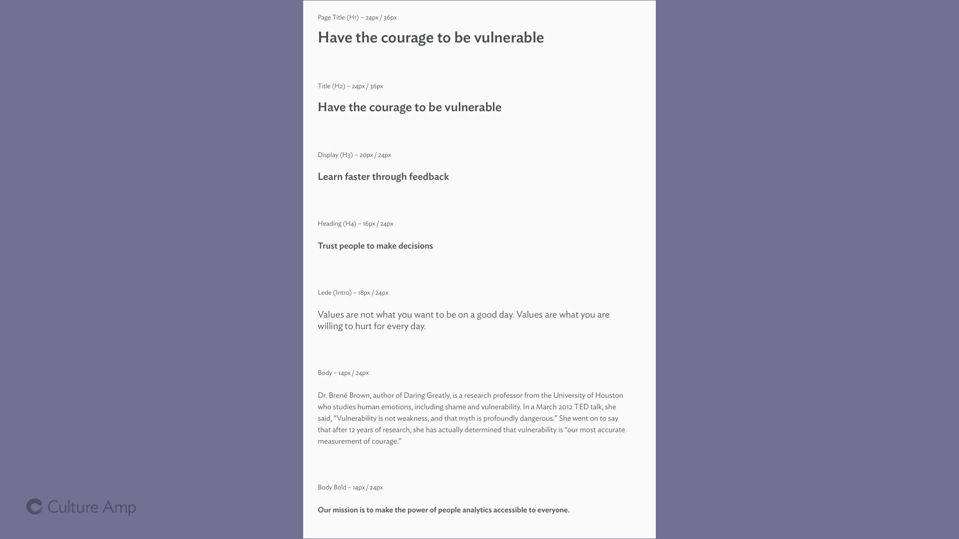
- Have the courage to be vulnerable
- Trust people to make decisions
- Learn faster through feedback
- Amplify others
How do these values impact our implementation of the design system? And how does our design system feed back into these values? Let’s take a look.
Trusting people to make decisions can be hard. There is a reason micro-managing is such a problem in so many workplaces. And when it comes to design systems, you often hear companies talk about introducing them precisely because they don’t trust people to make decisions. They don’t trust them to use the logo correctly, they don’t trust them to choose an appropriate header type style – so they codify the “correct” way in the style guide and make sure everyone follows it.
Dictatorial decision making doesn’t leave any space for creativity and innovation. I personally believe the most inventive things happen on the edge of a group – not in the center – and you don’t want to squash that by rigid enforcement of a system that takes away a team member’s ability to make a decision.
But more importantly – if you remove all freedom from your team, limiting the ability of your designers to design, and of your engineers to engineer better components, never allowing them to build anything new and better – they’re going to resent it, they won’t enjoy their jobs, and you won’t see their best work – their talents will be wasted.
So how do we balance the desire for consistency with the desire for freedom? Let’s take a look at some examples.
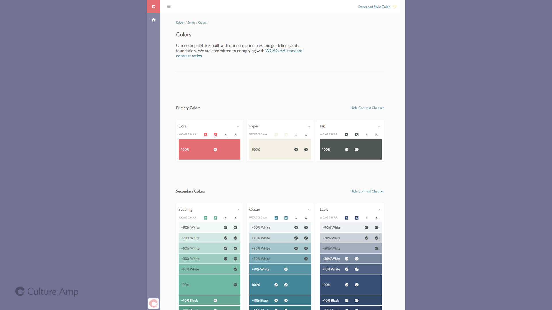
With our brand colors, we have a predefined palette of 3 primary colors (“Coral”, “Paper” and “Ink”), 6 secondary colors (“Ocean”, “Seedling”, “Wisteria”, “Yuzu”, “Lapis” and “Peach”) as well as a small number of tertiary special use colors. These base colors were decided on by designers from across the organisation coming together – it wasn’t an edict from on-high, it was a collaborative effort to unearth the color patterns already in use, and choose and standardise on those that most identified with our brand.
From those colors, we tint them (add white) and shade them (add black) to come up with nearly 300 variations you can use and still be on brand.
(Read more about that in my post How a design system can encourage accessible, on-brand colors.)
With defining this palette, the designers are asking us to trust them – for any text or button or border on the site, we should be able to use one of these colors.
And trust is a two way street.
In return, they can trust us engineers to make sensible choices within the palette. I know the system suggests we use “Ocean” blue for links, and I can choose the appropriate shade of Ocean depending on accessibility requirements, and make the decision myself, without needing to consult a designer.
We trust them to define a palette, they trust us to use it wisely.
We did a similar thing for type styles, defining a range of headers, paragraph styles, labels and more that could cover most of the usages on a page. (Click here to see our type styles).
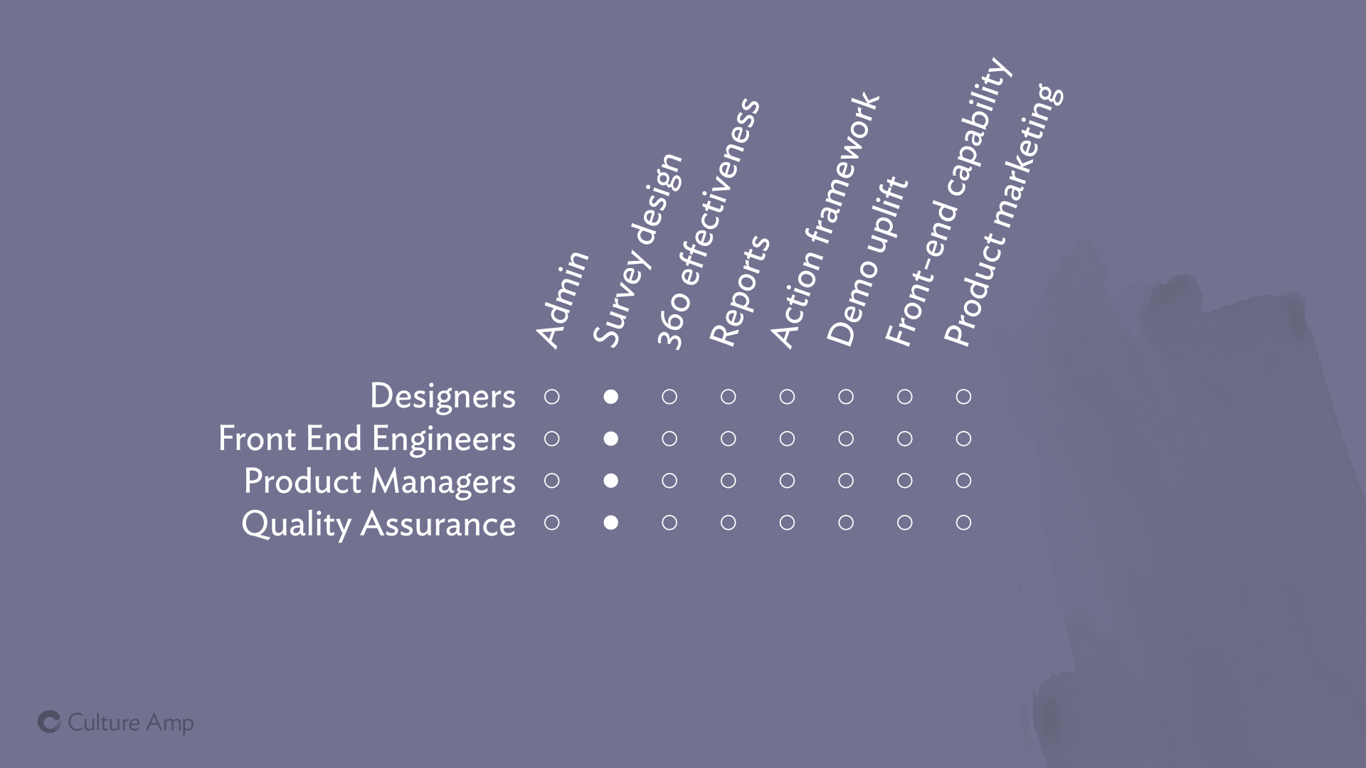
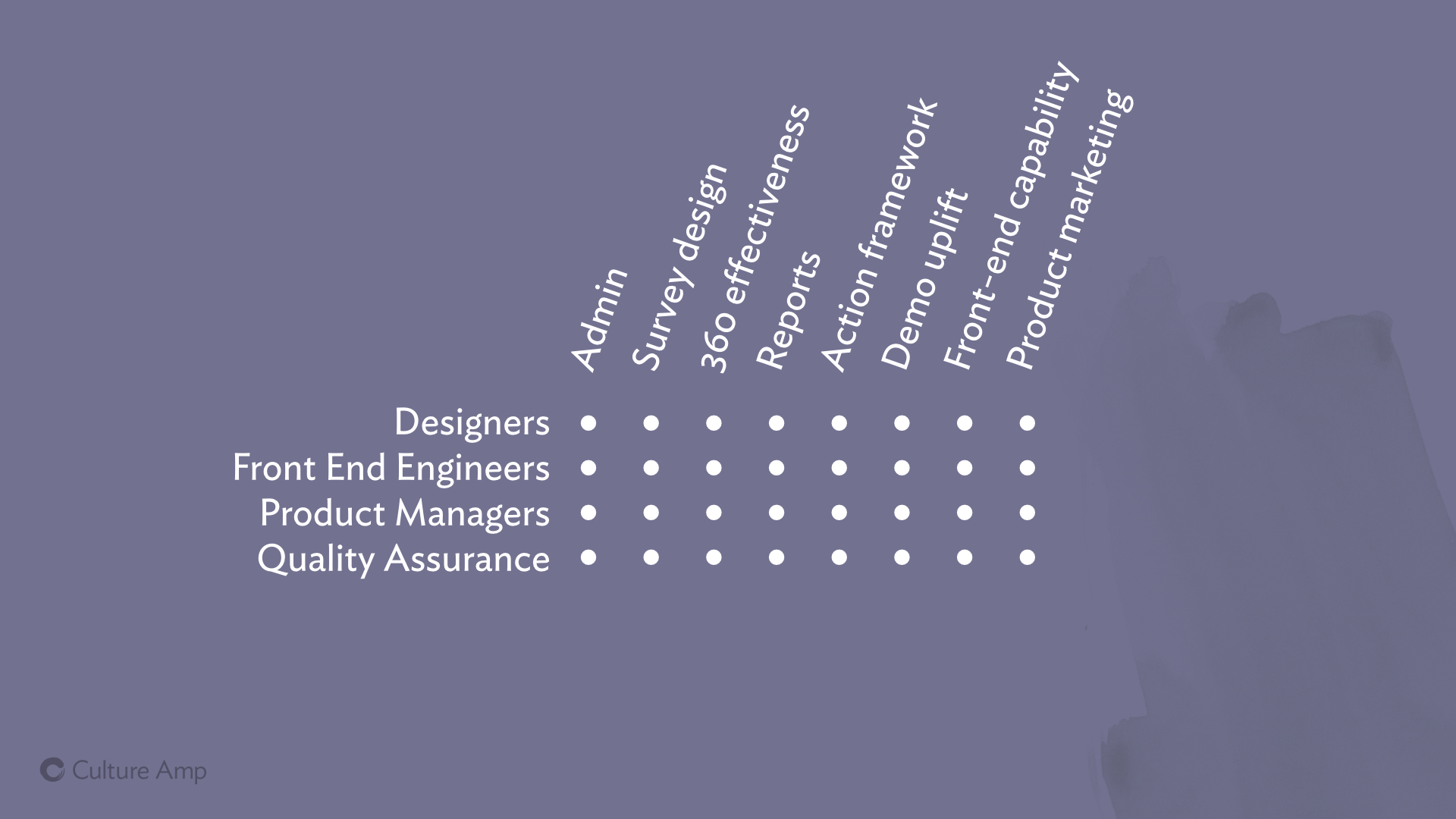
While I was giving this talk on Tuesday night I had Slack messages coming in from designers and product managers on one team talking to designers and product managers from our team – how much freedom would their team have to do what they needed for the visualisation they were designing – would they be free to explore or would they be limited to only a small palette of avialable styles?
Again, it comes down to trust. Those building the design system need to trust teams to know when and how to use it, and to know when to step outside it and try something new. If you trust that they share the same goal of great design and consistent design, then you can trust them to make the right call about when to experiment outside of the system. The work this team does may well bubble back up into the design system and become a standard for other teams to share.
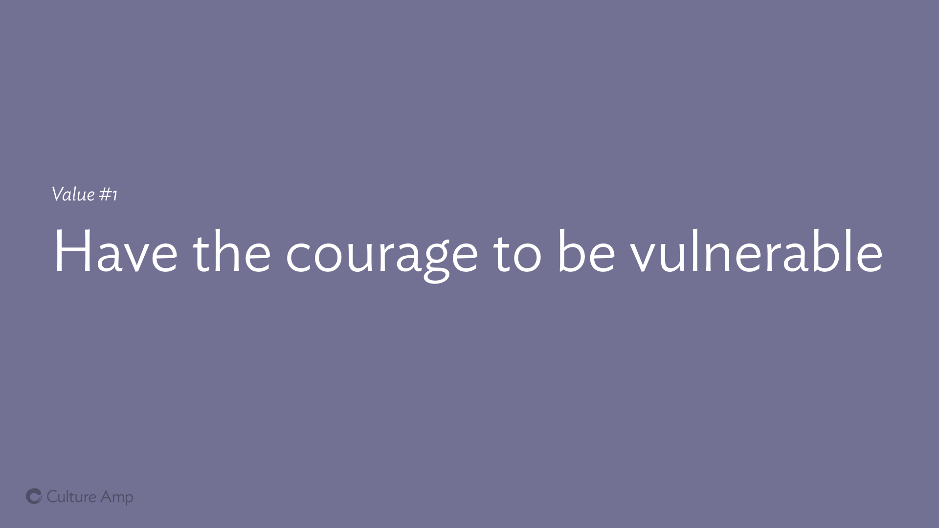
One of our other values is “Have the courage to be vulnerable”.
(If you have not watched Brené Brown’s exceptional Ted Talk “The power of vulnerability”, you should do so now).
One way this shows up in building a design system is fighting any tendancy towards perfectionism, which is common for many designers and engineers – we want it to be perfect before we share it with the world. We want it to be just right before other teams start using it.
But sometimes sharing it early, even when you still aren’t proud of it yet, or are maybe even ashamed of how it looks or how it’s built, is still a good thing, and can help someone else, even in the early and rough state.
This showed up with launching our design system website, www.cultureamp.design. Parts of it look nice, but no where near as nice as the mock ups. There are designs so beautiful and so on-brand that we really wanted to share them with the world. But perfect can be the enemy of good, and at the end of the day, we had to share this with out team rather than keep it a private secret. We got over our insecurity, and started sharing it, and people have found it useful, even if there’s so much we wish we could improve.
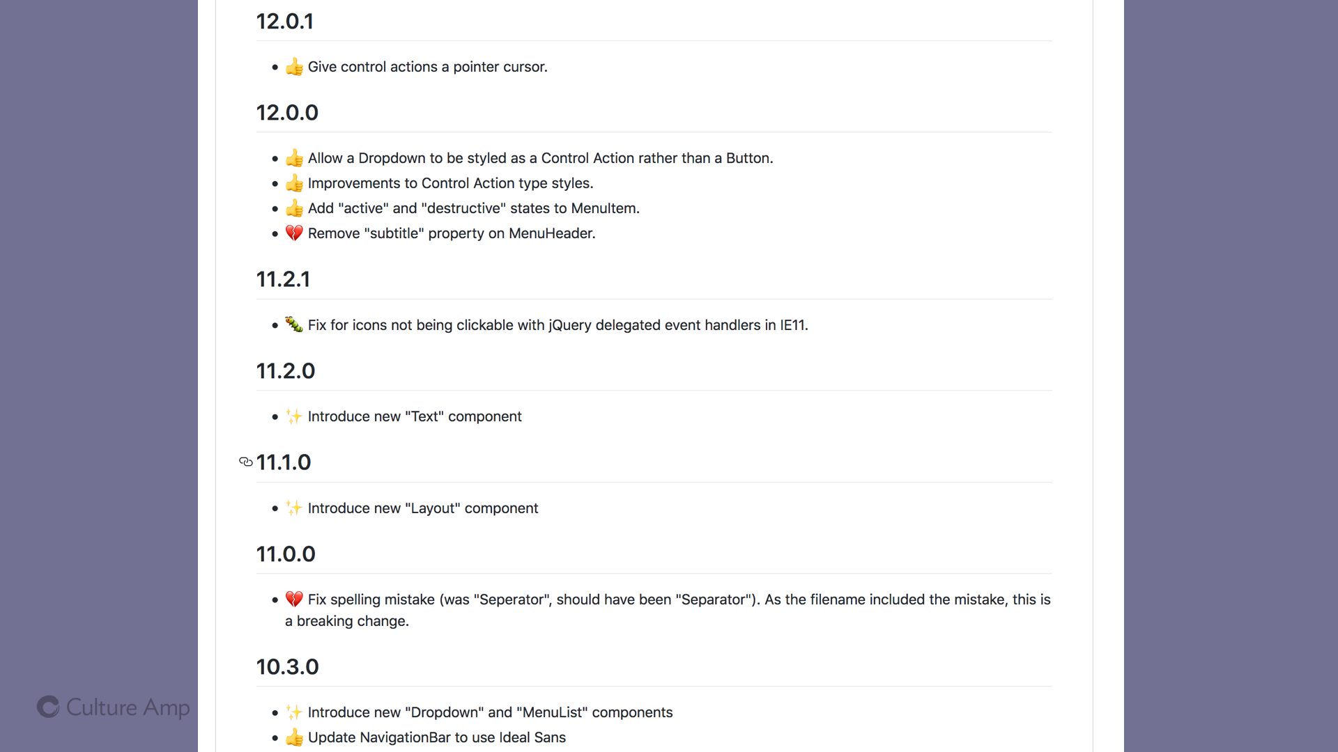
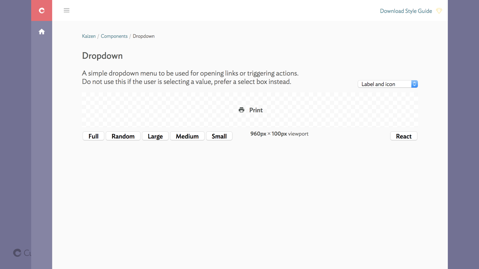
This has applied to the components we build as well as the website we use to showcase them. In the interest of moving faster and being less precious, I got excited and shipped a new dropdown component, including the ability to add a “seperator” to the menu. Not a “separator”. Yes I shipped a version of our design system with a spelling mistake, and fixing that was a breaking change, immortalised forever as a version bump in our CHANGELOG.
Putting yourself out there isn’t only about sharing your work early. It’s also about opening up the possibility for them to criticise the work you’ve done. Sometimes asking for feedback gives you feedback you didn’t want to hear.
We did this when our team, who are the main drivers of the design system, asked designers and front-end engineers from across the company for feedback on how we’re going.
Often we talk about user experience and user centered design, but with design systems, we have two classes of users: the end users of our product, and our colleagues who use the design system to build the product. Taking the time to listen to this second group, our colleagues and team-mates, is crucial.
And it ties into one of our other company values: Learn faster through feedback.
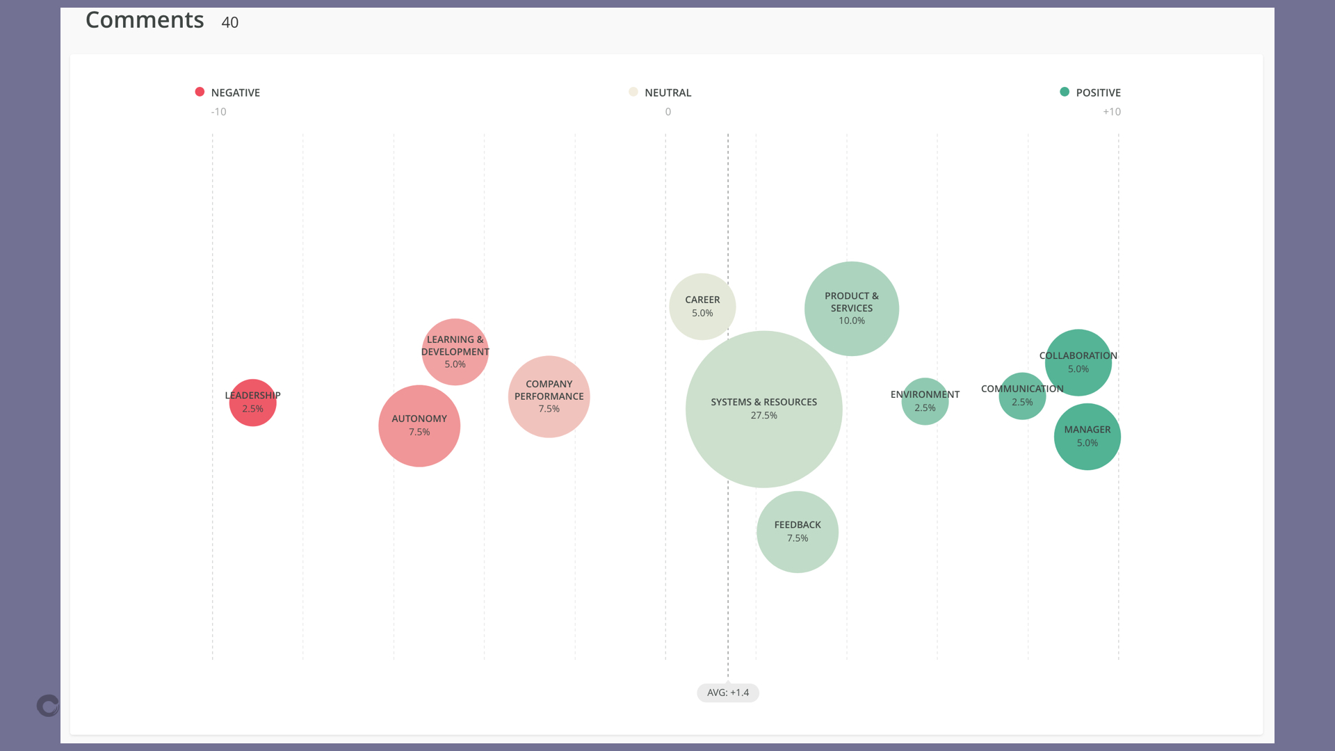
One key thing we learned through this survey was that we’d been over-investing in the base level styles (typography, color, icons) and underinvesting in the mid-level components (for example drop down menus, tabs, and select boxes).
Our team had been focusing on bringing consistency at the low level – changing typefaces and background colors and icons across the app, which was an enormous amount of effort on our part. But what would have helped the other teams more is if we built components that helped them deliver their designs faster. It might mean it would take longer to bring consistency to some of these fundamental styles, but it would mean that these teams are delivering valuable features to customers sooner.
That message came through our survey, loud and clear.
And at the end of the day, that ties into our fourth value:
Amplifying others. That’s the reason we’re building a design system in the first place – it allows us to amplify each of the product teams in our company, allowing them to move faster, stay in sync, spend less time sweating the fine details – and deliver a higher quality and more consistent experience to our customers.
That’s what it’s all about – and if we keep this in mind while we build out our system, it can help keep the work grounded, practical, and more likely to make an impact.
It isn’t about having the prettiest showcase of components. It isn’t about the elegance of your solutions, or the way you ship new components to your teams. At the end of the day, it’s about the people in your teams, and how you can amplify them, so they can build better products, faster, and with less stress.
And if amplifying your workmates does not motivate you, then you might have bigger team culture issues that a design system is not going to fix!
Have any questions? Feedback? Other observations on how team culture and design systems interplay? I’d love to hear them!