Categories
Front End Development

Dropping support for Internet Explorer 11 (when 18% of your revenue comes from companies still using it)

At Culture Amp we dropped support for Internet Explorer 11 in March this year, despite a significant portion of our annual recurring revenue coming from companies with over 10% of users still on IE11. We did that without complaints. How? Through a mix of customer conversations, clear planning, a neat technical trick, a focus on UX, and clear communication. Here’s the story of how we did it.

About us and our customers

To help understand the context we’re working in, it helps to know a bit about our company. Culture Amp is on a mission to create a better world of work, by building a software platform that helps companies understand their people and improve their company culture.

(p.s. Culture Amp is hiring engineers in Australia and NZ. It’s the best place I’ve ever worked. If you’re interested you can check out open roles or contact me, [email protected])

We have over 4000 customers ranging from small business to large enterprise. Some of our companies are progressive tech companies that have modern IT systems… and some still were using IE11.

Our leading product is an employee engagement platform which captures survey responses and shares insights and reports with millions of employees around the world. We care a lot about giving those employees a voice, and so we spend a lot of time making sure that our platform is accessible for as many people as possible. And browser support is a form of accessibility.

We don’t want to exclude people from our platform, and prevent their voice from being heard in their company surveys, because of their available technology.

Why we wanted to drop IE11

Having said that, supporting Internet Explorer 11 sucks. Most of our team are developing on MacBooks, so testing in IE11 requires either firing up a virtual machine or using a tool like BrowserStack. If you try to do this for every pull request, your pace of work really slows down. If you don’t, you start getting support tickets coming in because something unexpected broke in IE11, and those are hard work to debug too!

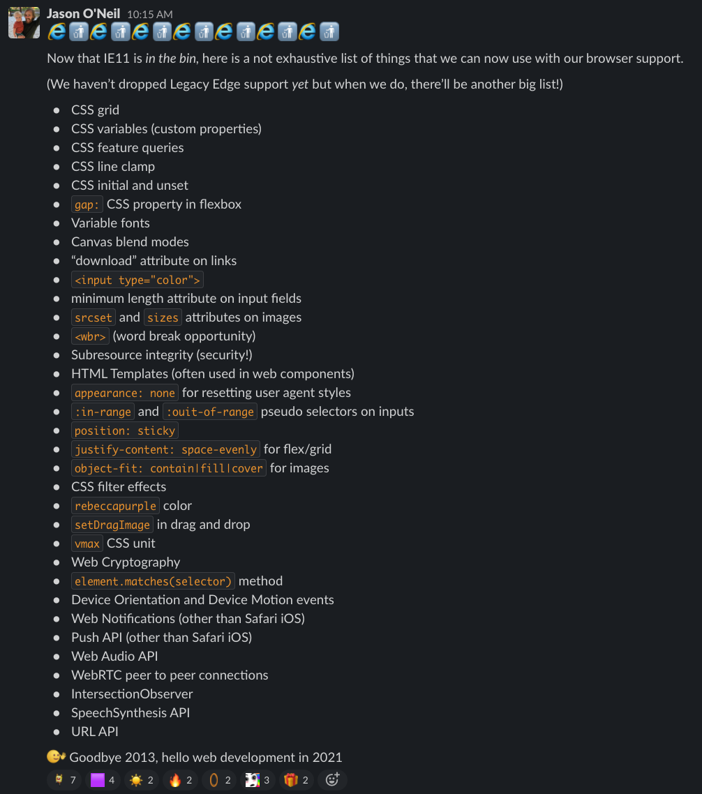
And also, we wanted to use new browser technologies. Being in the team that maintains our Kaizen design system, I was particularly excited about being able to use CSS Custom Properties and CSS Grid finally.

First question… is anyone still using it?

We were initially hoping we could look at IE11 usage and it would be so miniscule, no one would notice if we dropped support. (We dropped IE10 support when usage was below 1%).

Unfortunately, IE11 usage was sometimes still hovering around 8%, and some weeks went as high as 15%.

We wanted to understand it more, and so asked one of our analysts to look at the revenue amounts for the clients with high IE11 usage.

% of ARR
Accounts with >10% IE11 usage18.6%
Accounts with >20% IE11 usage9.5%
Accounts with >30% IE11 usage4.6%
Accounts with >40% IE11 usage3.4%
Accounts with >50% IE11 usage1.5%
This table shows a huge portion of our revenue came from companies still with over 10% IE11 usage. We needed to make sure whatever our plan was, we didn’t upset this many customers.

This was pretty discouraging, but we continued to explore our options.

Starting with a conversation

My manager Kevin Yank reached out to one of our biggest customers, who we knew required IE11, and asked to chat to understand what the situation was on the ground, rather than just looking at the analytics and giving up hope. When we chatted to them, we realized this big customer did have Microsoft Edge installed on all of their computers, it just wasn’t always the default browser when people clicked a link from their emails. If we could convince them to switch to Edge, which they already had installed, maybe we could drop support for IE11 after all.

We ended up using a version of this to reach out to all customers of a certain size who had > 20% IE11 usage. Here’s the message we used:

We’re hoping to understand the use of Internet Explorer 11 at your company.

Now that the more modern Microsoft Edge browser is available on all versions of Windows we’re hoping to redirect users of the old Microsoft Internet Explorer 11 (released in 2013) to the modern Microsoft Edge browser.

This browser is getting more and more burdensome for us to support; the user experience of our product in that browser is getting worse and worse (it is both slow and increasingly ugly there), and we’re approaching a couple of technical decisions that, if we need to support IE11, will put us in a restrictive box for years to come. (Even Microsoft themselves are beginning to no longer support Internet Explorer 11 on some of their websites!)

We’d love to understand a bit more about your IT environment:

– Under what circumstances are your users needing to access Culture Amp through IE11?

– Is there a more modern alternative browser installed on those computers that you could switch to if necessary?

Are you able to get answers to these questions, or connect us with the right person so we can discuss?

We worked with our customer account managers to send this message to all customers above a certain threshold who had high IE11 usage.

The result: every one of the customers we spoke to said that employees would have another browser (usually they mentioned Edge, sometimes Chrome) also installed that they could use, but it might not be the default.

So… if they have a better browser installed, how do we get them to use it?

A technical discovery for directing users to Edge

With the Engagement product I mentioned earlier, a key to the success of the product is having high survey participation rates. We knew that if we started blocking ~10% of users (and in some companies, >50%) it was really going to hurt the product’s effectiveness.

We needed a way to have users switch browser with a high conversion rate.

So we began asking, is there a way to open a page in Edge from a page in Internet Explorer? We found our answer on Stack Overflow – there is, using a microsoft-edge: protocol in your links.

You could also use the custom-protocol-check package on NPM to check if the link click worked, and display a message on success or failure. (Unfortunately, it can’t tell you if it will work before the user attempts the action).

We did some experimenting on Codepen, and it all worked!

A screen recording showing the Codepen example and how a link in IE11 can open the same page in Edge.

There was a big scary alert warning before Edge would open, but if you allowed it, it did work. We hoped that with the write UX design and some encouraging copy, we could convince users to click a button, click allow, and open the link.

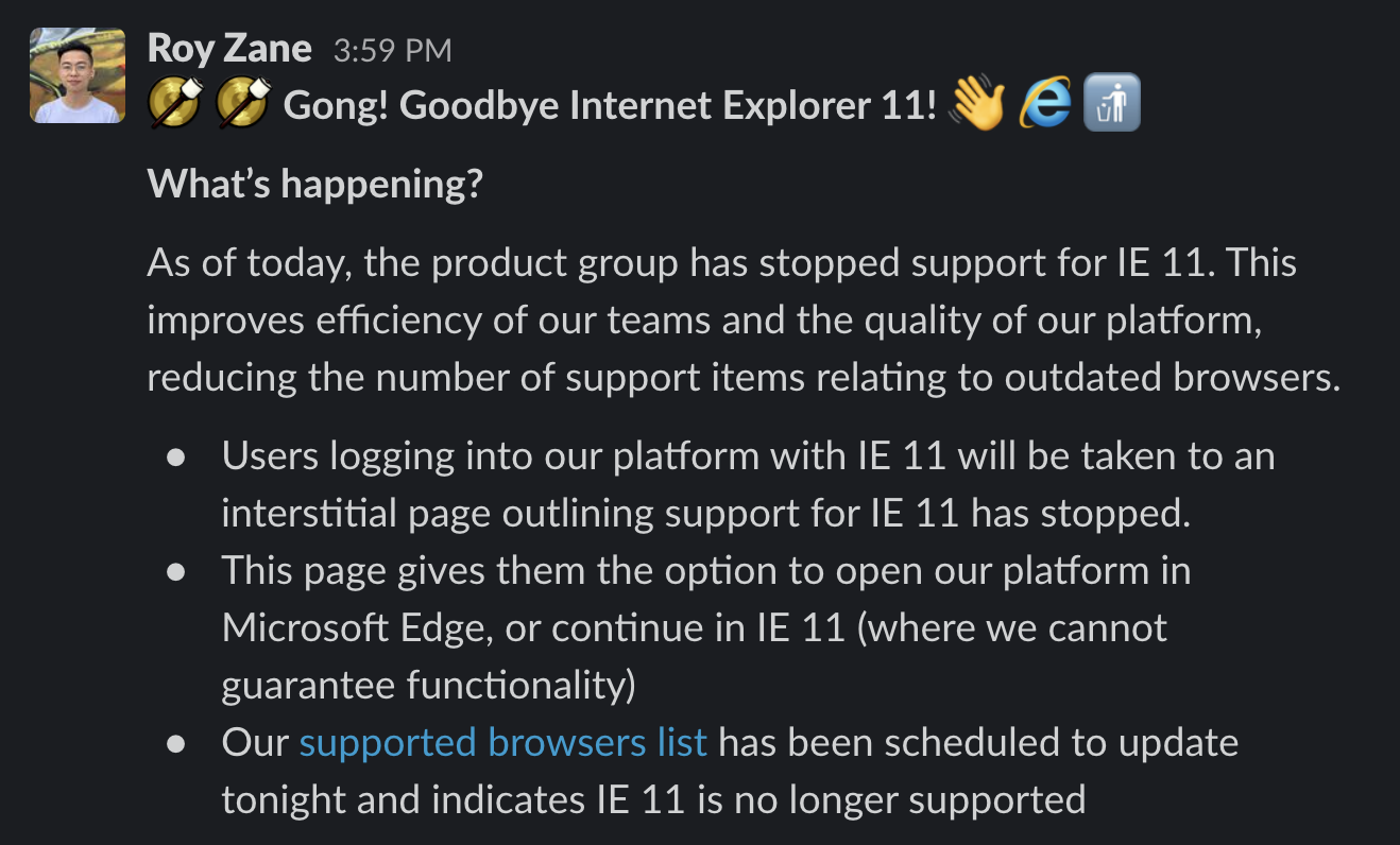
Stage 1 UX: a “soft” notification

The first phase was to show a persistent banner across the top of the page to all IE11 users, with a link that attempts to open the same page in Edge.

A screenshot of the notification, reading "Switch to a modern browser for a better experience. Culture Amp will soon end support for Internet Explorer 11. We recommend you open this page in Microsoft Edge."
A screenshot of the notification design.

When we released this, we knew most people would ignore the banner, because ignoring banners is what people do. But for those who did click, it would allow us to get analytics on how many of them were able to successfully launch Edge.

A bar chart showing 3 bars: "Edge Upgrade Banner Viewed" 2,303. "Edge Upgrade Download Attempted" 206. Edge Upgrade Success Modal Viewed 187.
We measured how many users saw the banner, how many clicked it, and how many had Edge open successfully.

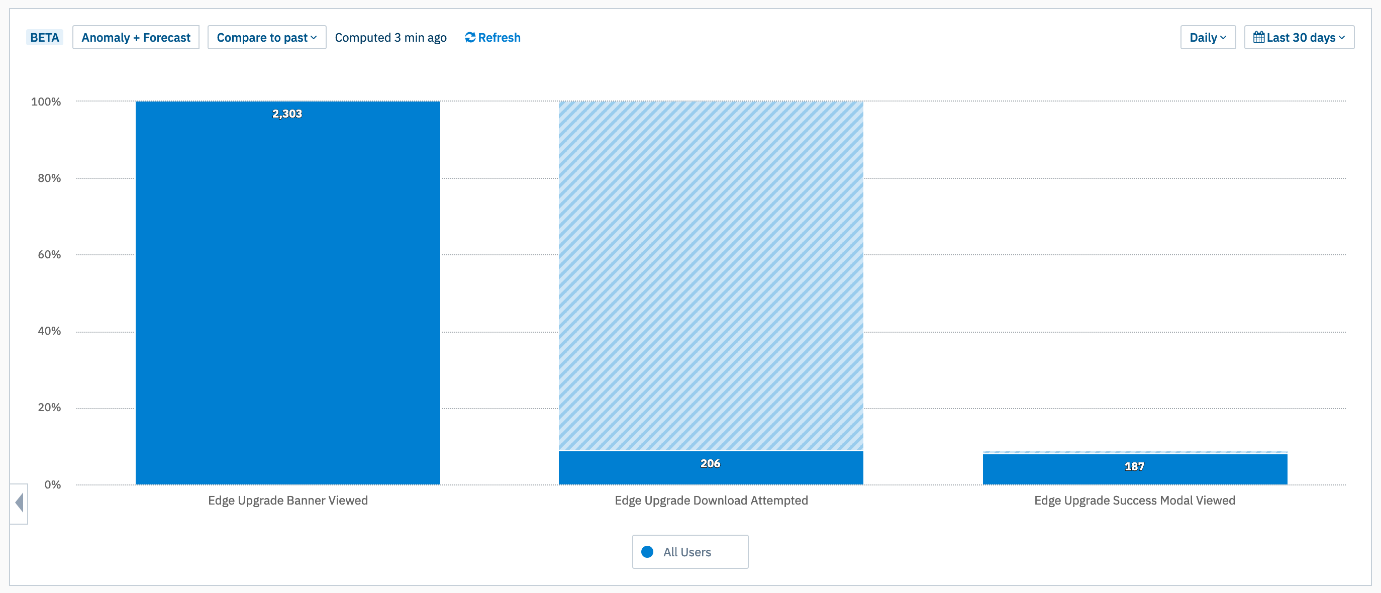
The good news: even though only 9% of people clicked the banner, when they did, 90% clicked “Allow” and successfully opened the page in Edge. (Apparently the scary alert box wasn’t as scary as I thought!)

A screen recording of the "Phase 1" workflow opening Edge from a banner.
The banner displays in Internet Explorer 11. When the user clicks the “Switch to Microsoft Edge” link, a confirmation popup appears, and when they click “allow” the page opens in Microsoft Edge.

So, all we needed to do was force people to click the button. And that meant something more forceful than a notification banner.

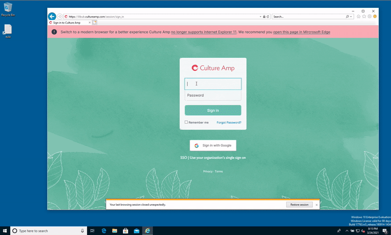
Stage 2 UX: a “hard” interstitial page

A screenshot of the IE11 deprecation page. It shows a page which reads "Internet Explorer 11 is no longer supported". There are two buttons, the primary button reads "Open in Microsoft Edge", the secondary button reads "Skip for now"
We hoped a full page interstitial would do the trick.

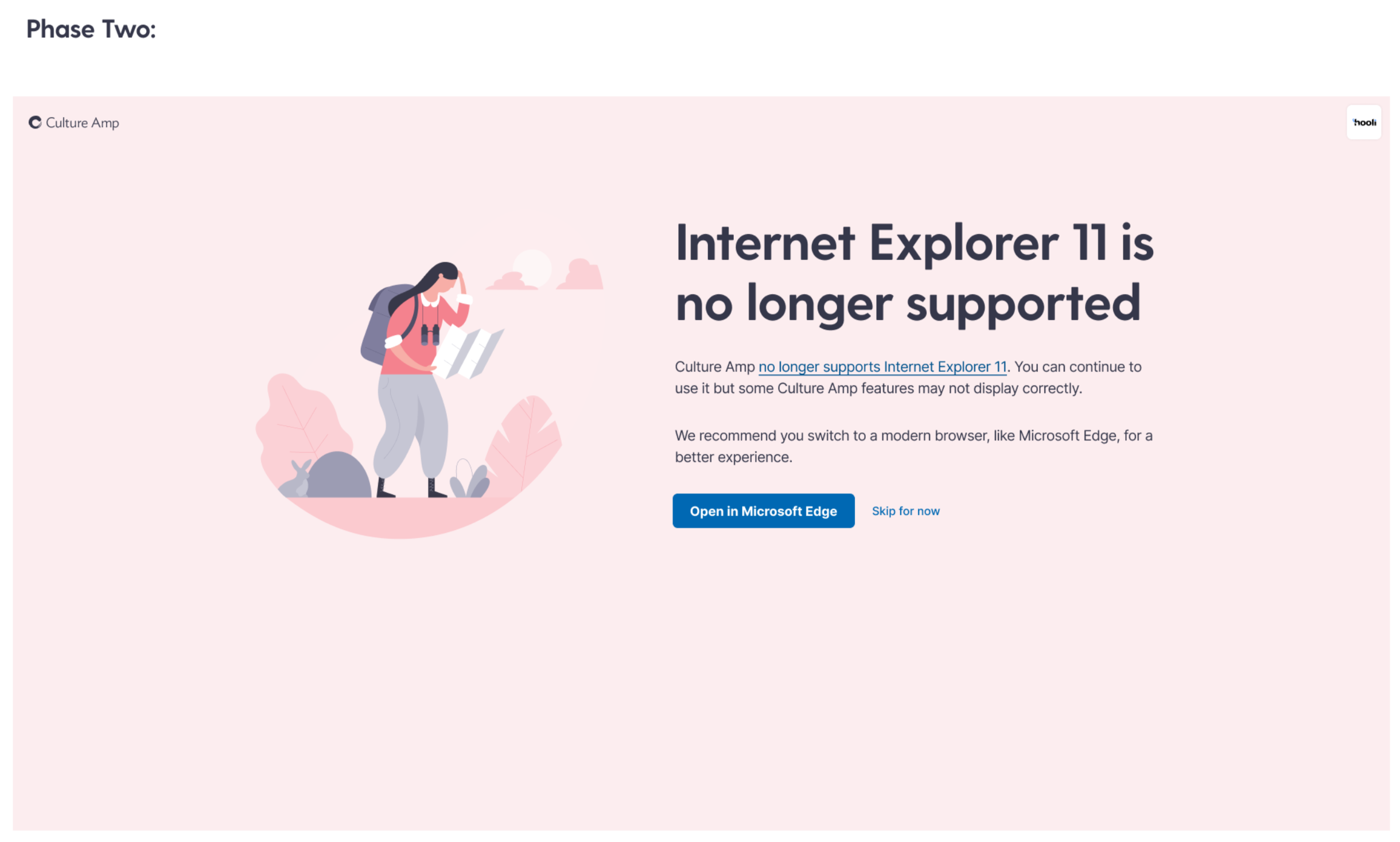
For the official end of support, we made it much harder to ignore. At our login screen, we redirected all users to a full page notification where the primary call to action is to open in Edge. This had much better results.

A bar graph showing 3 bars. "Edge Upgrade banner viewed" 2,415. Edge Upgrade Download Attempted 1,333. Edge Upgrade Success Modal Viewed: 1,223. The total conversion is 50.6% over the last 30 days.
This looks healthier! The absolute numbers here are smaller a few months after the transition – people are now visiting from IE11 less often. But the percentages have stayed about the same since launch.

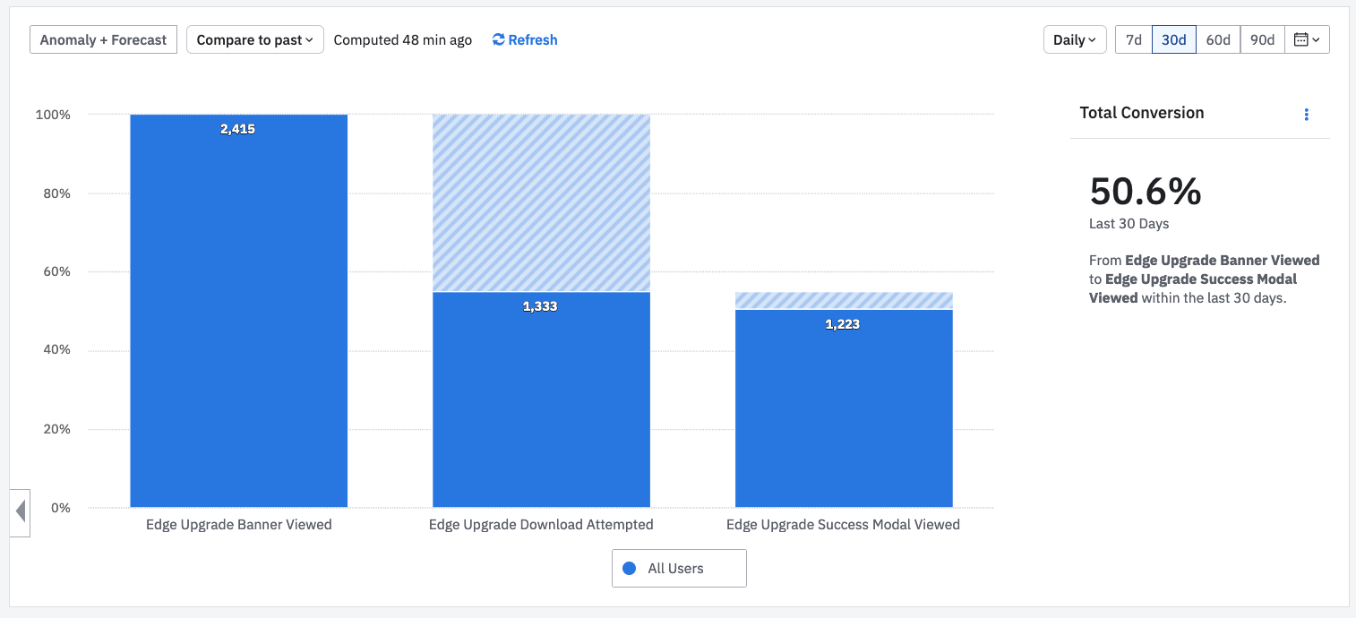
We now have 55% attempting to open in Edge, and 92% of them still succeeding, for an overall success rate of 50%. We believe most of the other users are switching to an alternative browser manually or bouncing.

Either way, this was enough to give us confidence that anyone who wants to use our platform, is able to. And our customers shared that confidence.

A screen recording of the "Phase 2" flow for opening Edge from an interstitial page.
On login the user sees a full page notification directing them to open in Edge. They were 5x as likely to click “Open in Edge” here compared to the top-of-page banner.

The timeline

January 2021Contact important customers to understand the impact.
January 27th, 2021Initial email to all customers. Deprecation timeline added to support guide.
February 1st, 2021Global Notification released and visible on all pages.
March 24th, 2021Final email warning to all customers. Support guide updated.
March 25th, 2021Support dropped. Interstitial Page released.
March 26th, 2021We get to stop caring about IE11 and start using new browser features!

The result

A screenshot of a Slack post, reading Gong! Goodbye Internet Explorer 11! (Wave emoji) (IE logo emoji) (Put rubbish in bin emoji)

What’s happening?

As of today, the product group has stopped support for IE 11. This improves efficiency of our teams and the quality of our platform, reducing the number of support items relating to outdated browsers.

Users logging into our platform with IE 11 will be taken to an interstitial page outlining support for IE 11 has stopped.

This page gives them the option to open our platform in Microsoft Edge, or continue in IE 11 (where we cannot guarantee functionality)

Our supported browsers list has been scheduled to update tonight and indicates IE 11 is no longer supported
Getting to announce this to the company was a special feeling.
A screenshot of a Slack post reading

"Now that IE11 is in the bin, here is a not exhaustive list of things that we can now use with our browser support"

Followed by a list of dozens of new HTML and CSS features.
Getting to announce this to our front end engineers was even better

We released the change, and no customers were upset by it. We continued to see a healthy conversion of IE11 visitors to Edge by clicking the button, and a trend of less and less IE11 visitors over time.

Our teams no longer have to fix bugs in IE11, and no longer have to fire up a virtual machine to check their latest change in an ancient browser.

And we can now use things like CSS Custom Properties, which we’ve used to roll out a theme switcher in our design system.

What I’ve learned

  • Matching product analytics with business data (like account value) can paint an important picture of the impact a change will have.
  • Sometimes product analytics aren’t enough to tell the full story, and conversations with customers unearth a clearer picture, which can open up new options you might have assumed were unavailable.
  • Releasing a risky change like this in two stages helps! You can use analytics to validate a part of the conversion funnel you’re worried about (for us, if the “Open in Edge” button would actually work for people).
  • Large enterprise customers are more reasonable about old technology than I had originally thought.

Special thanks to my coworker Roy Zane who was my main collaborator in driving this project through to completion.

Categories
Front End Development

How a design system can encourage accessible, on-brand colors

This is the blog post version of a talk I gave at the Perth Web Accessibility Conference. I also repeated the talk at a “BrownBag” team lunch at Culture Amp, which you can watch here, or you can read the blog-post version below. I’ve got a live example (open source! try it yourself!) at the end of the post.

How a design system can encourage accessible, on-brand colors from Jason O’Neil on Vimeo.

On the front-end team at Culture Amp, we’ve been working on documenting and demonstrating the way we think about design, with a design system – a style-guide and matching component library for our designers and developers to use to make our app more consistently good looking, and more consistently accessible.

But first, a story.

Here’s a photo of me, my older sister, and younger brother:

A photo of 3 me and my siblings in school uniforms
Me at the back, my sister and brother in the front

Me and my brother are both red-green color blind. Most of the time color-blindness isn’t a big deal and compared to other physical limitations, it doesn’t usually make life difficult in any significant way.
But growing up, my brother Aaron really wanted to be a pilot. Preferably an air-force pilot, like in Top Gun. But for a generation that grew up with every TV show telling us “you can be anything if you try hard enough”, there was a footnote: anything except a pilot. He couldn’t be a pilot, because he was red / green color blind. The air-force won’t even consider recruiting you for that track. They’ll write you off before your old enough to join the air cadets.
Why? Because the engineers who designed the cockpits half a century ago made it so that the only way you could tell if something changed from safe to dangerous was if an LED changed from green to red. So people with red-green color-blindness were out, and my brother was told he couldn’t be a pilot.

A photo of an aircraft cockpit with lots of small controls, and green and red lights
Cockpits have lots of small controls, and some of them rely purely on red/green color distinction to be read accurately.

Now, becoming an air-force pilot is super-competitive, and he might not have made it anyway, but to have your dream crushed at the age of 10, because an engineer built a thing without thinking about the 8% of males who are red/green color blind, is pretty heartbreaking.

Luckily, as web professionals we’ve got a chance to create a digital world that is accessible to more people, and is a more pleasant experience, than much of the real world. We just have to make sure it’s something designers and developers are thinking about, and something they care about.

So, design systems

One of the big lessons we’ve learned in the web industry over the last few years is that if you want your site, product or service to leave a lasting impression, it’s not enough to do something new and shiny and different. What’s important to a lasting impression is consistency: consistency builds trust, and inconsistency leads your users into confusion and frustration and disappointment.
It’s true of your branding, it’s true of your language and tone, it’s true of your information architecture, and it’s especially true of your commitment to creating accessible products and services. For example if your landing page is screen-reader friendly but your product is not, you’re going to leave screen-reader users disappointed. Consistency matters.
But as a company grow, consistency gets harder. It’s easy to have a consistent design when you have a landing page and a contact form. It’s harder when you have a team of 100 people contributing to a complex product.
The Culture Amp team has experienced those growing pains – we’ve grown from 20 employees three years ago to over 200 today, almost half of them contributing to the product – and it’s easy to lose consistency as users navigate from page to page and product to product. The UI built by one team might feel different and act differently to the UI built by another team.
So we started looking into design systems.

A screenshot of the "Lightning" salesforce design system website
The Salesforce “Lightning Design System” showed how a strong design system can bring consistency to a whole platform, even with 3rd party developers

Design systems are a great way to bring consistency. By documenting the way we make design decisions, and demonstrating how they work in practice, we can help our whole team come together and make a product that looks and feels consistent – and that consistency is the key to a great experience for our users.

As we codify our design thinking we are lifting the consistency of our app – not just of our branding and visual aesthetics, but of our approach to building an accessible product.

Culture Amp’s approach to color

So we’re a start-up, with three overlapping product offerings build across half a dozen teams. And we want to make that consistent.

One way to do that would be to have a design dictator who approves all decisions about color usage, making sure they’re on-brand and meet the WCAG contrast guidelines. But one of our company values is to “Trust people to make decisions”, and that means trusting the designers and front-end engineers in each team to make the right call when it comes to picking colors for the screens they are in.
How do we let them make the call, but still ensure consistency?
Well, as a group our designers worked together to define the palette they would agree to use. They consisted of three primary colors (Coral, Paper and Ink), six secondary colors (Seedling, Ocean, Lapis, Wisteria, Peach, Yuzu), as well as Stone for our standard background.

A screenshot showing our 3 primary colours and 6 secondary colours
Our color system starts with 3 primary colors and 6 secondary colors. I have no idea how the team picked the color names…

Every color on the page should be one of the colors on the palette.

But what about when you need it slightly lighter or slightly darker? When you need more contrast, or want just a slight variation? We allow designers to use a color that is derived from the original palette, but with a tint (white mixed in) or a shade (black mixed in).
We can actually figure these tints and shades out programmatically, using SASS or Javascript:
(The embed here demonstrating programmatically generating colour palettes no longer works, sorry)
(Note: the SASS code is even easier. You can use the lighten() or darken() functions, or the custom mix() function if you’d prefer to tint or shade with a custom color. All three of these functions are built in.
So now we have three primary colours, and six secondary colours, and computationally generated tints and shades for each in 10% increments, resulting in 171 colour variations, which all fit with our brand. Woo!

A screenshot of the various tints and shades of 3 secondary colours, seedling, ocean and lapis
By adding tints and shades to our base colors, we can generate a flexible but consistent color palette

This range gives enough freedom and variety to meet individual teams needs on a page-by-page basis, while still bringing consistency. Designers are free to move within this system and make the right decision for their team.

So what about color contrast?

Currently Culture Amp has committed to complying with WCAG AA standard contrast ratios. This means the contrast between the text color and the background color must be at least 4.5 for small text, and at least 3.0 for large text. (If we wanted to go for WCAG AAA standard contrast ratios, those values 7.0 and 4.5 respectively).
How do we get the designers and developers on our team thinking about this from the very beginning of their designs? We could audit after the designs after-the-fact, but this would be frustrating for designers who have to revisit their design and re-do their work. Making people re-do their work is not a way to win friends and advocates for your color contrast cause.

<Note: I had an embed here, that demonstrated auto-generated colour palettes, but it no longer works>

So we can actually check whether our colors will be able to hold white or black text with a sufficient contrast ratio. And because we derive our color values programmatically, we can check if all 171 of our derived color values are accessible with large text or small text, black text or white text, and display all of that information at a glance:

A screenshot of our colours page where each derived colour displays a series of ticks to show if it is accessible with white text or black text in both small and large sizes
We can programmatically check contrast, and show at a glance which colors support white text or black text at small and large sizes.

Now our designers can come to this page, explore every color within our palette, and at a glance know which of these colors will be able to display text with sufficient contrast to be considered accessible.
For bonus points, we can also programmatically determine if a background color would be better suited to have text colored white or black:

<Note: I had an embed here, that demonstrated auto-generated colour palettes, but it no longer works>

If you build it, they probably won’t come

So we’ve made a great page where designers can explore our palette colors, and at a glance gain an understanding of which combinations will have sufficient contrast. But by this point everyone in the software industry should hopefully know that “if you build it, they will come” is simply not true. If you want people to engage with your design system – or with anything you’ve built – you need to offer something of value, you need to solve a real problem for them.
So how do we get the designers and developers across our different teams to care enough to come look at this page? We need to offer them some convenience or solve a problem they have.
What are the most common things our team needs help with when thinking about our brand colors? They usually want to explore the range of the palette, and then find a HEX code or a SASS variable to start use that color.

A screenshot of a team chat where someone asks for the brand color codes so they can use them in Canva to design an infographic
People on the team need to know what the brand colors are. Now we can send them to this page, and they’ll see the accessibility info as a bonus.

A screenshot of the dropdown menu showing color values in SASS, HEX, RGB and CMYK formats
We have a dropdown that lets our team copy/paste the colour values so they can use them in their design tools or their code

So we tried to make our design system colors page as helpful as possible, providing a way to explore the colors, see the shades and tints, see what colored text it best pairs with, and copy color values to your clipboard.

Next time someone needs to reference our brand colors, this feature set means they’ll come to our design system page first, because they know they can explore the colors, and get the correct codes in whatever format they need. We’re solving a problem for them, and, while we have their attention, using the opportunity to inform get them thinking about color contrast and accessibility.

What else?

So we’re just getting started on our journey of using design systems to improve the consistency of our design and our accessibility. But color contrast is a great place to start, and it’s already making me think about how we can use the design system project to put accessibility front-and-center in the design culture of our team.
The web’s most popular component library, Bootstrap, solves a problem for designers and developers by allowing fast prototyping of common website elements, but by offering components with accessibility concerns baked in, and by encouraging good accessibility practice in their documentation, they’ve used their design system to lift the level of accessibility on millions of websites.

A screenshot of the Bootstrap website
Bootstrap was one of the first open source component libraries, and works hard in its documentation to encourage accessible use of its components.

If you have other ideas on how design systems could be used to bake accessibility into your team culture and product design, I’d love to hear about it! It’s an exciting project to be part of, raising the design consistency and the accessibility consistency across the various products offered at Culture Amp.

If you’d like to join us, Culture Amp is hiring front end developers – either in Melbourne, or remote within Australia. It’s an amazing place to work, I’d encourage you to apply. See the Culture Amp Careers page for more info.

Bonus #1:

Our whole Color Showcase component is now available open source. You can view the Color System Showcase repo on Github or even try embed it online by entering JSON code on this page. (Sorry, this link no longer works).
Here’s a live iframe preview with Culture Amp colors inserted:

Bonus #2:

If you want to test how your site would look to a completely color-blind person, you can type this into the browser console:
document.body.style.filter="grayscale(1)";
Try it!

Two screenshots of our colors page, with the left being in full color and the right being displayed monochrome
Adding the `filter: grayscale(1)` CSS rule is an easy way to notice places your design is too dependent on colour